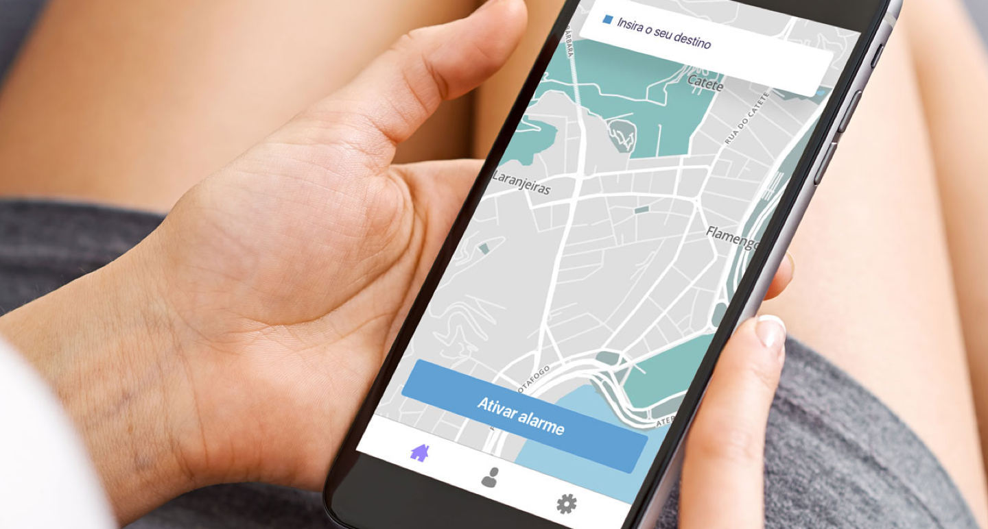
Wekker
Details
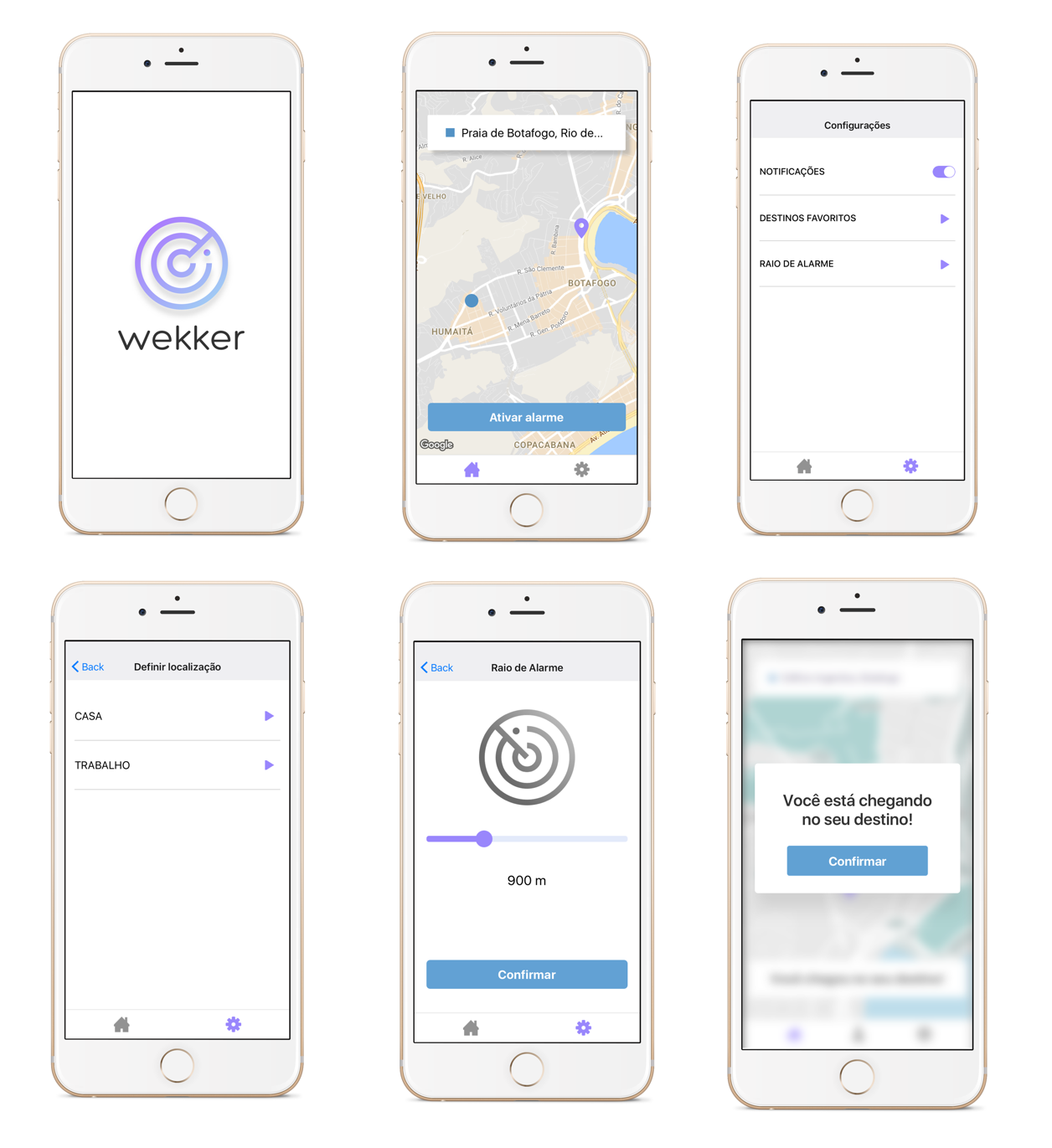
Wekker is a project designed to improve the quality of life of people who sleep on public transportation through an intelligent and predictive alarm system. I'm creating an app for IOS and Android using React Native with the help of the developer Gabriel Kozlowski. The project’s main function is to wake up users when they are near their departure point. Beyond that, the users can choose the distance after which they are going to be woken up and can define standard destinations. With these standard destinations, the app will be able to track the users. Then, in the moment when users go leave their initial points at a specific time, the app will be proactive and ask them if they would like to activate the alarm. So users no longer need to worry about activating the alarm everyday.Role
Research UX & UI Usability test HTML and CSSDate
01 Jul 2017
The problem
Due to my lack of time, I began to realize that I was spending more than an hour and a half on public transportation and I often slept on them. I started to look around and realized that many people were sleeping on the same bus, just like me. The biggest problem I had, while sleeping inside the bus, was missing the drop point and having to walk or get another bus to go back part of the way. And that made me wake up often to check out where I was. After talking to friends, I came to the conclusion that people suffered from the same problem I did, so I decided to create a project that would wake people up when they were near their destination.
Usability test
After analyzing similars, the first thing I did was a paper prototype to test with users whether the basic interactions and functionalities had the correct flow or if something was missing. For that, I used the “Five act script interview” and it was very interesting to realize how it wasn’t necessary to include a mandatory login and to identify the need for a proactive alarm system.
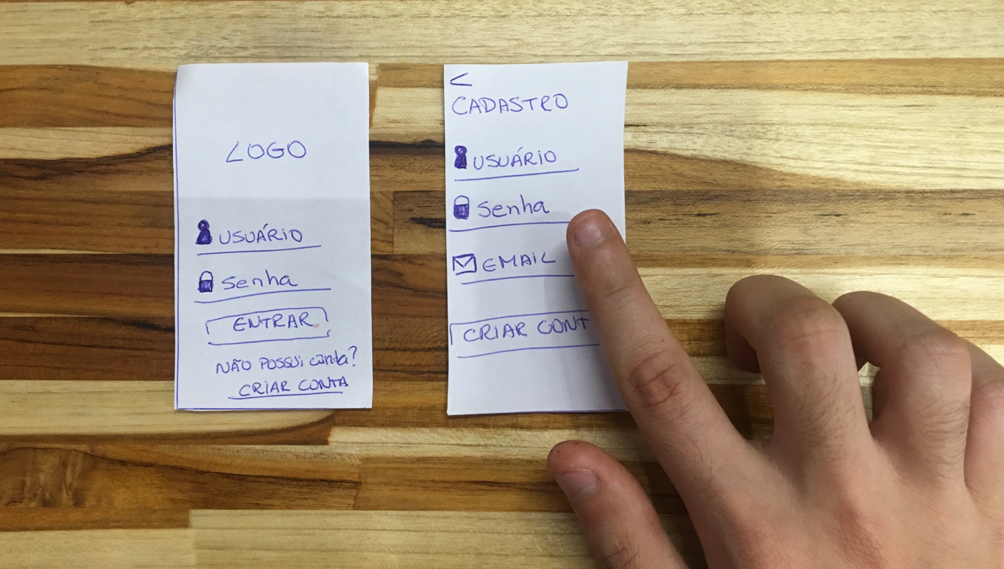
Sketching
Second Usability test
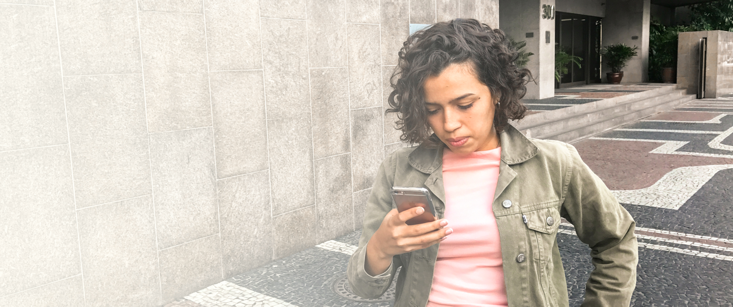
After all the screen modifications, I made a second usability test to identify impressions regarding visual identity, flow, and interactions. At this stage, I did two different tests. One of them was indoor and happened in a controlled environment; the other happened on the street to simulate the user interaction while heading to the bus stop. The tests were done using invision and it was very important to identify some lack of consistency in the buttons, small font size in some parts and lack of certain feedbacks to the user.
Visual identity
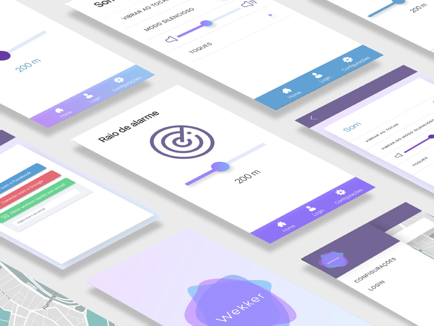
For the development of the visual identity, I did a research about colors to understand which ones were related to the idea of relaxation and calm. And the name, in turn, means “waking up” in Danish. I wanted the name to relate to the main function of waking, but at the same time it shouldn’t sound obvious – I wanted an abstract name.
Final screens
Developing
The app development is being done with React native for both Android and IOS. We are using the google maps API for the map and it has been a great technical challenge for me because I have never made an entire application in React native.
