KLM Food and Beverage voucher
Details
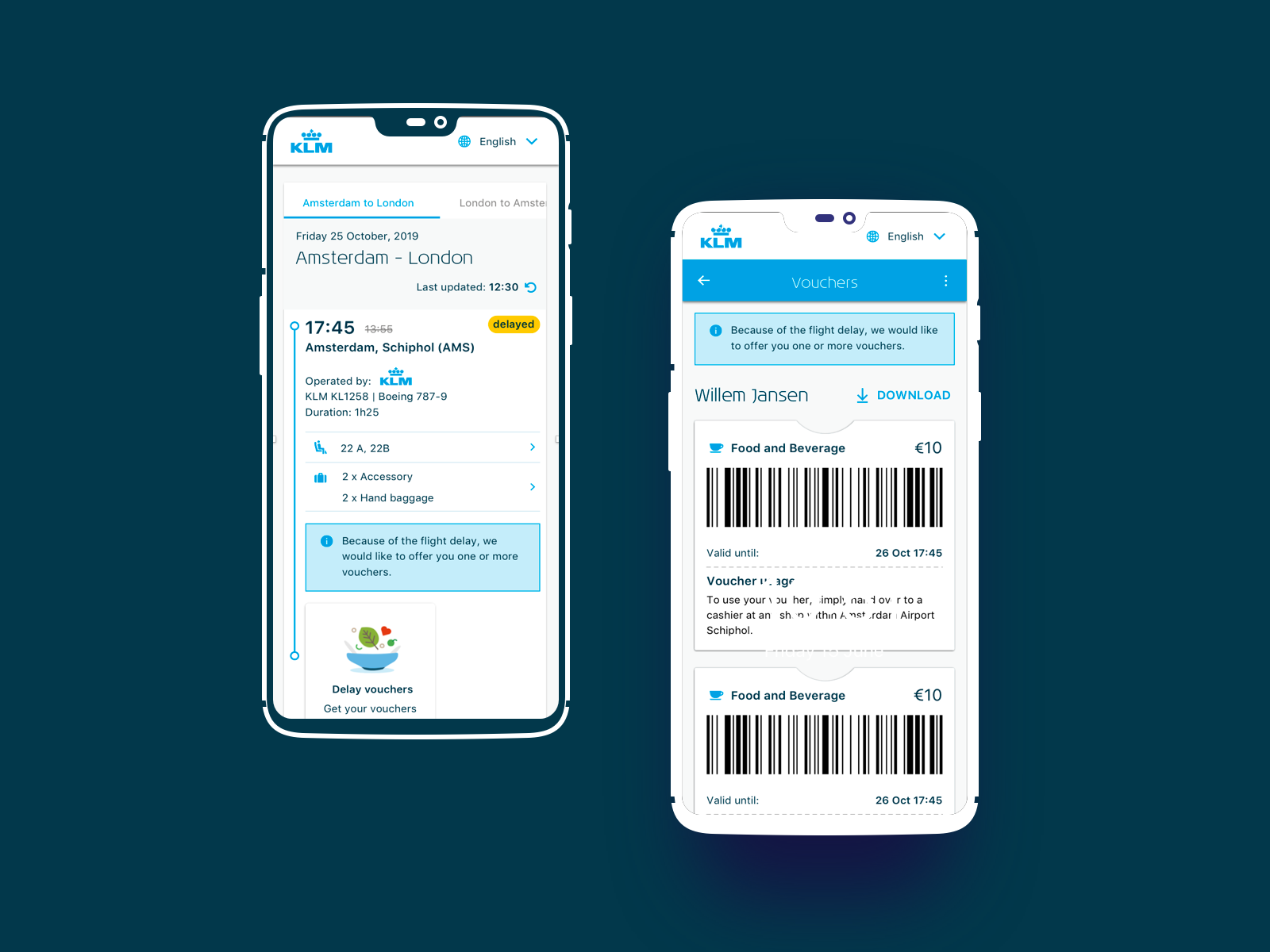
Food and Beverage vouchers are offered for users facing disruption of their flight. That could be when the flight is delayed for more than 2 hours or when it's canceled. Each passenger receives a voucher and the amount varies according to the time that they will need to wait at the airport. Nowadays in most scenarios we only offer the voucher printed on paper that is given by the flight attendants or via our Kiosks machines, causing extra lines at the airport and causing stress to our users.Role
Research UX & UIDate
01 May 2020
Goal
Inform and advise customers about disruptions, and enable them to act upon it, through meaningful dialogue, following those pillars:
- Holistic
- Personal
- Proactive
- Giving control
- Consistency
- Transparent
Challenges
No one is happy that their flight is not going to be on time anymore. It’s very common to observe that the stress level of our users gets high when there is delay, cancellation, or uncertainty of when they will be able to embark on the plane. Working on an interface to solve this kind of issue is always challenging.
Process
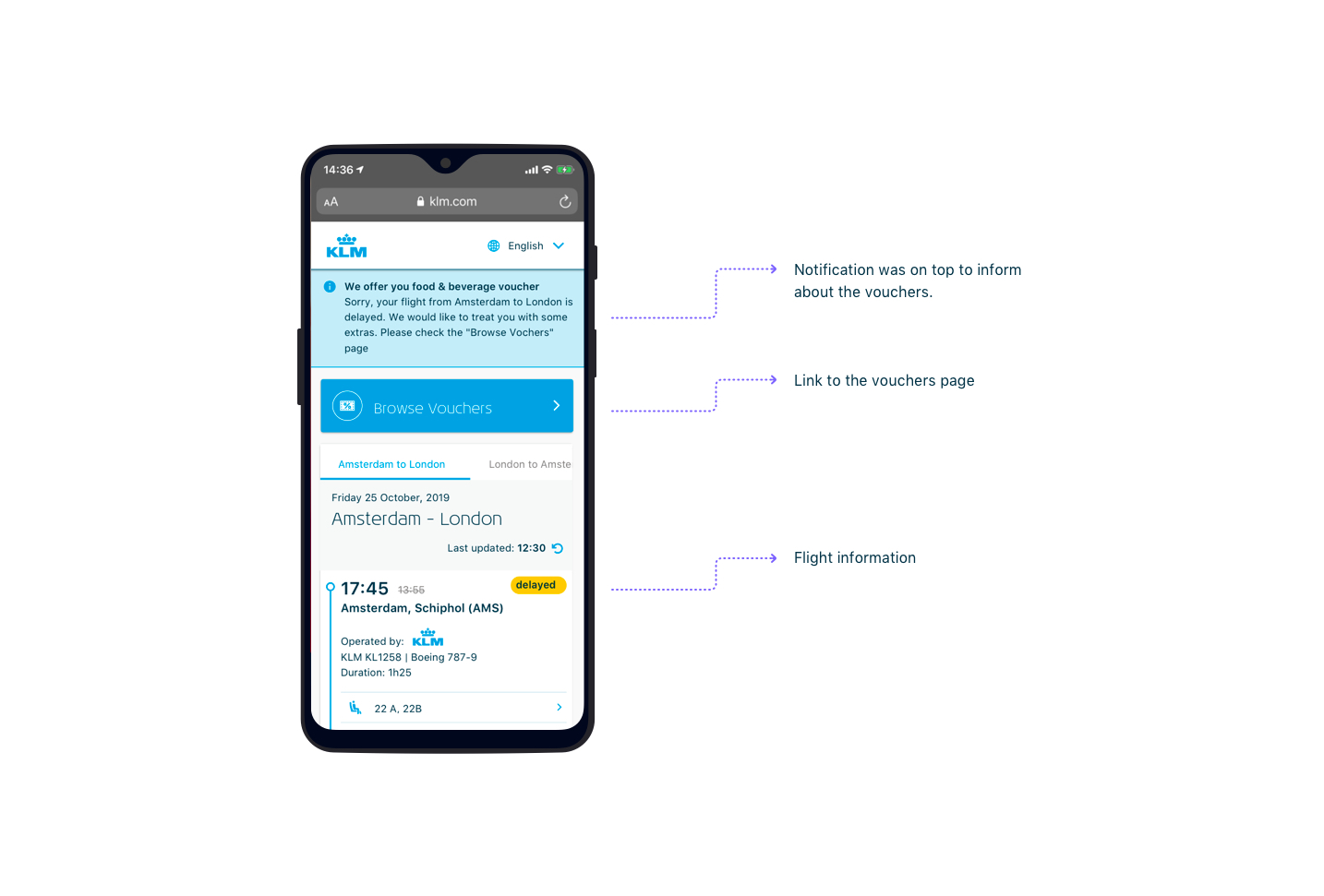
The first thing that we do is to inform the user that their flight is disrupted. We do that by sending SMS, email, or notification in the app in case they have it installed. Following our researches, we’ve noticed that the most important information that the user is looking for is the new departure time.
In one of our prototypes, we have done a design with a notification on the top informing about the vouchers, but since they had to scroll to their new departure time, they didn’t scroll up again and missed our offer completely. So we concluded that we needed to offer the vouchers after the user checks their new departure time.

During our researches, we also noticed that people were confused by our ancillaries’ offers during the time of disruptions. Because we were still offering them to stay at our lounge, some of the users thought that we were actually offering it for free as compensation or we even got reactions like: “Nice, my flight is delayed for 5 hours, but I can still spend more money to stay at your lounge during this time”. So by that, we decided to remove any offer that would be unnecessary and by analysing our data, we noticed that people usually didn’t buy our third offers as well like hotels, cars, or activities during a disruption flow. So we’ve decided to remove them as well.
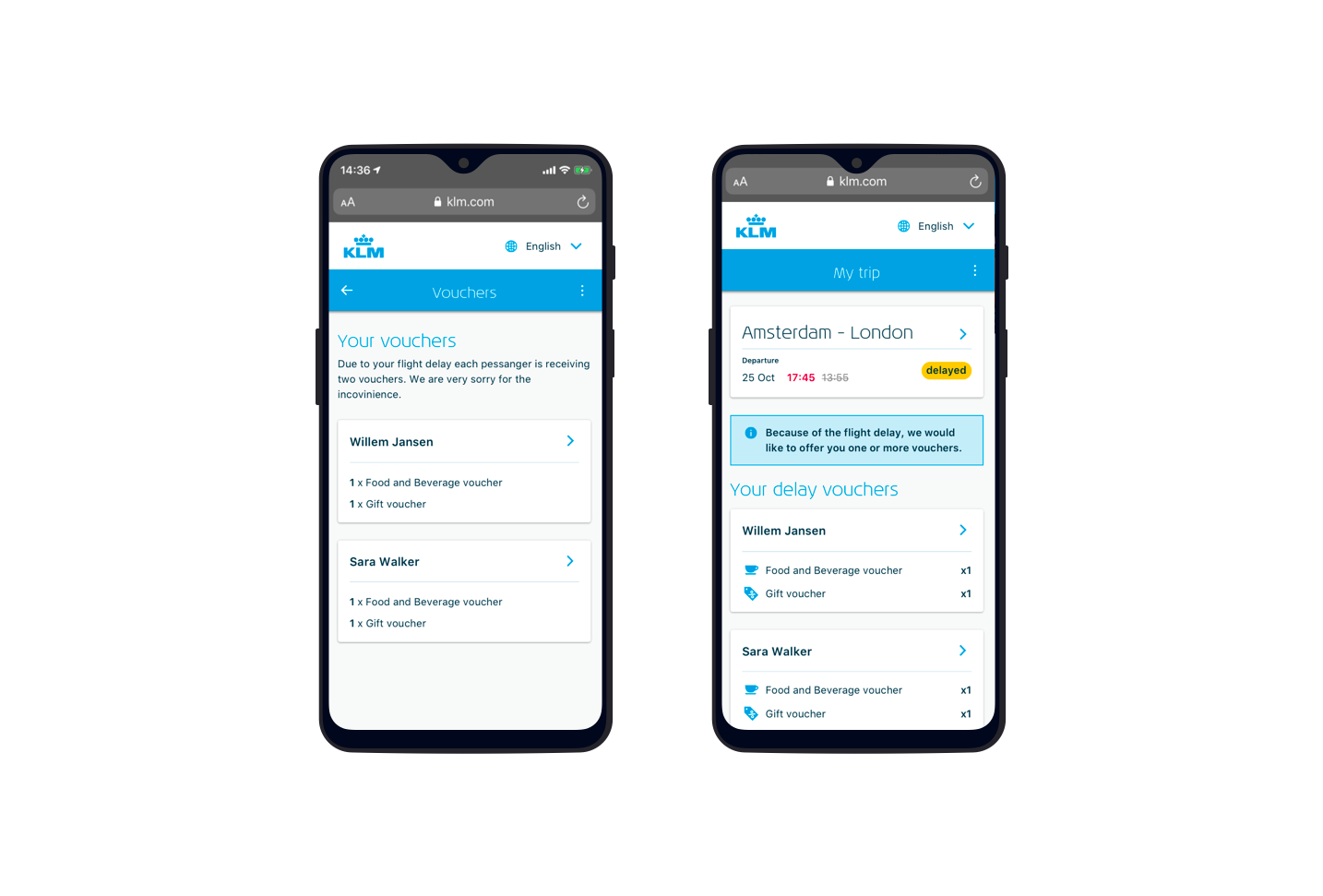
Another challenge that we had was how to display the vouchers per passenger. In one of our designs we decided to split a page per passenger, but immediately when they were going deeper in the flow, they would forget about the other pages and they would assume that these are all their vouchers. We even thought in the beginning that the response was because we were testing only with one person, but the same happened when we tested with couples and families. So we decided to have one page with all the vouchers and split by the name of the passengers.

Results
With this final flow, we have done more user testings and we noticed that people could easily go through the flow without any problems. They managed to understand what is their new departure time and were able to activate and use their vouchers.
