InStore
Details
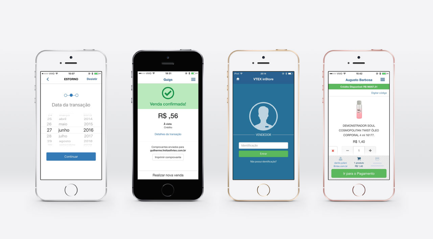
InStore is a solution that came out to change the experience of buying inside physical stores. With it, it’s no longer necessary to wait in long queues to make payments. Also, it enables the salesman to make a custom sale on his own. Thereby, the physical space of the store can be different, with the possibility of finishing a sale anywhere inside the store.InStore works on hardware that processes payments with credit cards and an app for both IOS and Android. Its biggest advance, though, is the integration with the entire VTEX platform. I worked as a designer in this project for 10 months, alongside another designer, Augusto Barbosa. During this period, I performed researches with final users, usability tests, modifications for Android, adaptations for tablets and UI improvements.Role
Research UX & UI Usability test HTML and CSSDate
01 Jun 2016

The problem
The problem we were trying to solve was mainly the large queues in stores due to the need to pay in cash. Because of that, the store’s space was being misused, resulting in poor distribution of customers and overcrowding the cashier area.
Interview and Usability test
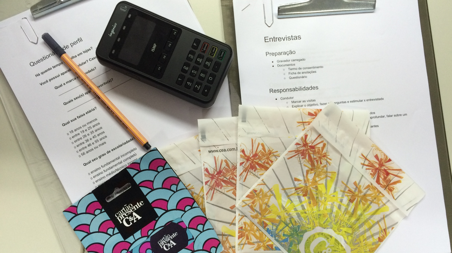
To better understand what the seller’s needs were, we interviewed managers and sellers from two stores. In these interviews, our goals were to understand their daily work, how they used payment software and checked the products, and to identify the biggest difficulties they faced in performing their tasks.
In addition to the interviews, we performed usability tests to identify possible errors in our interface. Without these two steps we could have not included in the project the possibility of consulting more information about a product: product description and details, for example. We also identified the need for an interface that serves more than one customer at a time and interaction and communication errors with the user that needed correcting.

