Air France and KLM my trips
Details
My trips is the area where the user can see an overview of all of their future trips and past trips. They can also see all the details of a specific trip, being able to see their full itinerary, select their meals, buy extra ancillaries, add their passenger passport and visa information, request an invoice and so many other actions that are available at this page.Role
Research UX & UIDate
01 May 2020
Highlights
I have been working on this project for more than one and a half year but I would like to highlight 3 features.
Next best action (NBA)
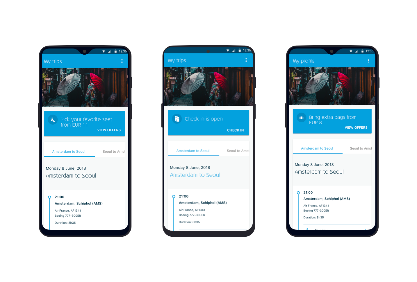
When traveling the user has many phases during our journey and also a lot of things that they need to prepare for being able to enter the plane. An example could be adding your passport information, getting extra baggage for a long trip, being reminded that they need to have a visa for their destination or that they need to check-in.
To simplify those actions we decided to create a dynamic component that behaves differently according to the user context.
This could also be used for commercial purposes. So in case we know that this user is used to paying for an Economy Comfort seat, we would also offer that via this component.

Ancillary offers
Ancillaries offered by cards
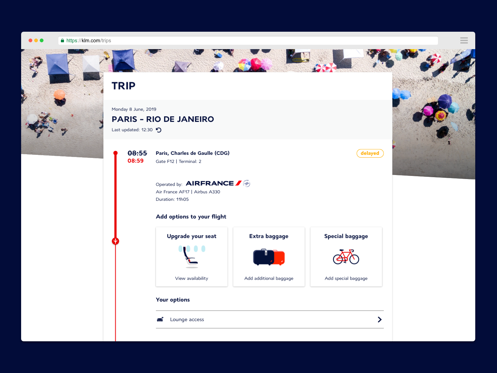
The first design that I have done for the ancillaries was to offer them using cards with a title and a description. Example: Lounge - Buy access

Ancillaries with rich illustrations
Since we launched this design, we wanted to improve our conversion, so we decided to add rich illustrations to be more appealing for the users. We did an A/B test for that and actually brought the conversion to an extra 2%.

Ancillaries with From price
After doing more user testing, we noticed that some people thought that the extra options were things that they don’t need to buy, but just extra items that they have. One of the reasons for that could be the Copy.

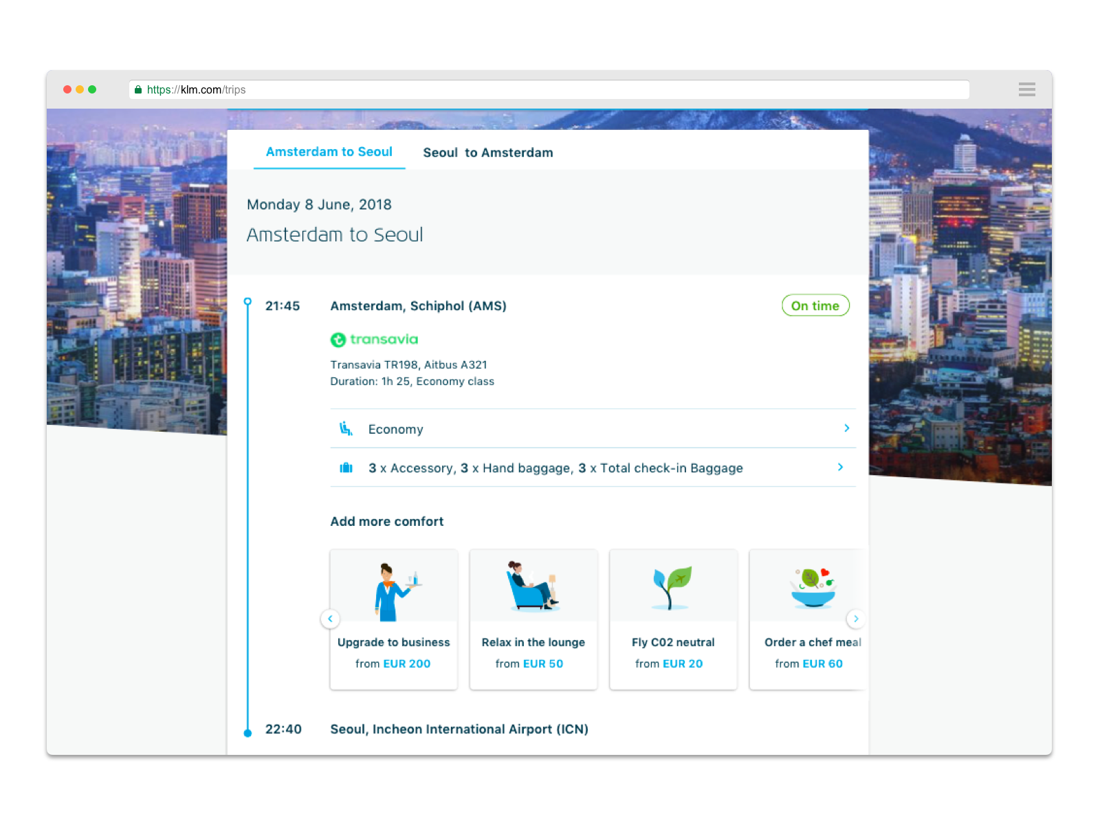
Another thing that we noticed during our testings was that people that are not used to buying extra ancillaries would assume that everything is expensive and they got very surprised by the actual price of them. So we decided to show the minimum price for the ancillary on the card as well.
We knew that the price would help to convert more users, but our design already had too much information. To solve that we decided to merge the title and the description into a single phrase.
With that solution, people would understand that the ancillary is not included or free of cost and they will already know how much that could cost.
Usage of Tabs for the itinerary
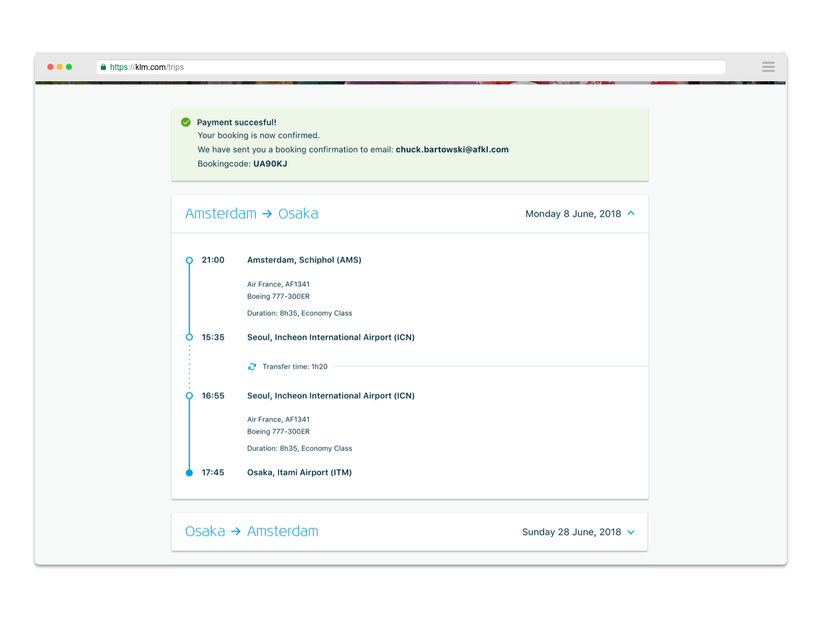
During user testing sessions, we noticed that the user was having difficulties to find their itinerary information because our page was very long with the use of expandable panels for each segment of their trip. From a business perspective, having a long page was also not beneficial for our selling of third parties ancillaries that were placed on the bottom of the page.

We decided to update the designs by replacing the expandable panels with tabs. With this new design, we have done more user testing and noticed that the user could easily navigate from one tab to the other. And we also created a logic that when part of the trip if already flown we open the page with the next flight tab already opened. With that, we help to guide the user for their next flight focusing on that itinerary and keep the page shorter than before.

